Thursday, 16 April 2015
Sunday, 11 January 2015
Audience Report Study
Audience Report Study
Magazines have been around since the 17th century
and in more recent centuries became one of the most popular forms of mass media
communication along with newspapers. Because magazines have been around for
such a period of time, there is very few niche markets left to build one
within; this is why I carried out research to try and find my target market and
how I should design my magazine.
The first question I asked was, ‘what is your gender?’ Whilst it may seem irrelevant due to the fact that I can pick one and work from there, I felt I should ask and see who responded more on the social media websites that I used to advertise my survey. The results were 79% female and 21% male, this shows me females were the most likely to use social media and are the most interested in magazines. I said the survey was to create a new magazine, because more females answered it suggests they are looking for a new magazine. This will impact my magazine because I am going to design my magazine for females.
The second question I asked was ‘how old are you?’ I asked
this question to further my target market, by having a specific age I can use
colour schemes and artists that would appeal to that age group and make my
magazine more popular. The most common answer was 16-18 year olds. This will
help me design my magazine because I can now use this to my advantage and
create my magazine so it is suitable to the target market of 16-18 year old
females.
Another question I felt was important was ‘how do you read
magazines?’ I felt this was important because I wanted to know how to sell my
magazine. In the 21st century, particularly since 2010, more and
more print magazines have been shutting down or transferring to internet copies
due to the increase of digitalisation. The most common answer was paper
magazines followed by the internet; this is useful because now I know to create
a paper friendly as well as online ready magazine.
The next important question was ‘what is your favourite genre of music?’ I thought that this question was important because the magazine I am creating is a music one; this means that the most popular music type will be the one I will create a magazine for as it will be most likely to sell. The answer which was most common was R&B music; this means I will base my magazine around this genre.
I also asked the question ‘what is your favourite colour?’ I asked this because my magazine needs to have a colour scheme which can be associated with the artist, the magazine and the genre. The most popular colours were black and gold. These colours tie in well with the genre because, black and white would be base colours and gold connotates power, wealth and create a regal air. All these things can be linked to R&B and give a theme I am happy with my magazine being associated with.
The next question I felt was important to the creation of my magazine was ‘what do you like to read about in a magazine?’ This question is important because it will let me know what stories to have on the front of my magazine, the contents page and what to write my double page spread about. The most popular answers were as follows in order, new music/artists, gossip and then fashion. This means that my double page spread will be about a new artist and feature stories will be music reviews, fashion in the music industry, relationships etc.
The final important question for my magazine was ‘do you prefer female or male artists?’ This is important because it will help me create/decide on an artist for the front of magazine and double page spread as well as others to feature on the contents page. The gender with the most yes answers was females, this means that my main artist/s will be female.
In summary through research I have decided my magazine will be an R&B one, with female artists and with the colours purple and gold. It will be aimed at 16-18 year old girls.
Thursday, 20 November 2014


Thursday, 6 November 2014
Deconstruction of magazines: front covers, contents pages and double page spreads
Deconstruction of Front Covers
Vibe Front Cover

I am deconstructing a magazine called 'Vibe', this magazine was first published in 1993;it has recently turned online only, this is because young people can now access information on the internet so sales of printed magazines have decreased, therefore proving it is aimed at young adults. The name links in with the theme of being a music magazine because vibe is a musical word; it is also a young persons patois. This magazine is aimed at young males who are interested in R&B music, we know this by looking at the colour scheme which is red, black and gold. These colours represent males because they are masculine colours and show wealth and fame which young men are interested in, also red is quite a hip-hop colour which is what the magazine is based around. We further know that it is aimed at young men because of the stories mentioned on the front cover, these stories would not be aimed at men in their forties, for example, because they involve things that young single men are interested in such as 'sex, drugs and R&B' and 'fashion haters.'
The typography used is attractive to young men because it is big and bold which is what young males want to be, big and muscular and bold when talking to females.
The features on the front of the magazine link in with the target demographic of the magazine, this is clear because they are stories young males are interested in, as they star idols of the audience e.g. Kanye West and R.Kelly. The typography of the cover stories is in a basic, clear font which makes it easy to see that it is a young mans' magazine as it means that it is easy for them to see what they are going to read and there is no mis-leading titles which could confuse them. Whilst this reinforces the stereotype that men can not multi-task or understand multiple pieces of confusing information, it is seen across the board when it comes to men's magazines.
The cover star on this issue of 'Vibe' is Kendrick Lamar, referring to my earlier point that the names of stars on the front cover are idols of the demographic, Lamar is also an icon of young males, especially those who are interested in hip-hop and R&B. The pose Lamar is carrying out is a dominant pose, this is a personality males want to have over females, and in some aspects it can be argued that women of the same age of the demographic want to be treated as submissive. The clothes that he is wearing are very classic and produce the idea that he is a powerful, clean and impressive, as he is wearing gold jewelry; this creates a God-like image which is further shown through the headline. The headline that goes with the image of Kendrick Lamar is 'The new God MC' this links in again with the demographic as he is an idol so labeling him as a God further makes him a desirable person to be, he is someone to worship.
When it comes to the codes and conventions of this issue of 'Vibe' the masthead is the most noticeable. The masthead is a code of a magazine, on this magazine in particular the masthead fades into the cover stars head, this breaks codes and conventions which is what in an essence hip hop does, also the fading is young and trendy further attracting young men. The issue number, date, price and bar code are all in one place and are in basic black and white, this means that the reader's eye is not detracted from the main image.
Vogue Front Cover

Vogue magazine is a leading women's fashion magazine, first published in 1892 by Arthur Turnure, it is now one of the most bought magazines in the world, published in 23 different countries every month around the world.
The demographic of 'Vogue' is middle-class, 25-50 year old women who are interested in fashion. We know this by looking at the codes and conventions of the magazine, for example the masthead. The masthead of this particular issue of the magazine is a gold colour, this colour is representative of the wealth and elegance of which the audience of the magazine are often associated with. The font that is used for the masthead is classic and simple which further reiterates the idea that the magazine is designed for the benefit of the target audience. An interesting point about the masthead that is worth noting is that it is partly hidden by the cover stars head, this is telling us that the magazine is so famous you do not need to see the whole name to know what it is; it also tells us the cover star is extremely well-known and worth covering the masthead for.
Another code of a magazine is the bar code, like on many magazines the bar code on the front cover of vogue is hidden at the bottom of the page along with the issue number; however the date and price are at the top of the magazine next to the masthead. the price is placed here to attract some attention and remind the demographic it is an expensive classy magazine explaining the cost.
The amount of the cover stories on the front of the page is very few which would normally tell us it is a magazine made for men, however we know Vogue is a female magazine. The use of the basic layout and little amount of text is telling us it is an elegant magazine which does not need to sell with gossip and loads of information as it is so popular.
The main story is Going for Gold, we know this because it is in the biggest text and is the most eye-catching, also it is over the cover star telling us it is very important. We assume the cover star is related to the main story, this would further show how the magazine is aimed at wealthy middle class women, this is because the cover star is Kate Moss, one of the worlds best known models who fits in to the target audience of the magazine. Her pose on the front cover of Vogue is in line with the male gaze as she is in a low cut dress and her hair is styled in a vintage 1950's style reminiscent of Marilyn Monroe, who was arguably one of the most lust after females of her time and is now still seen sexually in today's society. An example being this front cover where even Kate's dress is symbolic of Monroe's in 'The seven year itch.' Although Kate Moss's eye line is directly aimed at the camera showing dominance her lips are slightly parted showing a sultriness and her head is pointed downwards shoeing submissiveness.
GQ Front Cover

The stories featured on the front cover of this issue of GQ tell us even more about the target audience of the magazine, for example, the 'men of the year awards' the readers of magazines buy particular magazines as they aspire to be like the cover stars or enjoy the content. if the content is about the best men in their respective fields it tells us readers want to be like these men and be rich and famous like them. Further cover stories talk about politicians, this information would not be typically useful to young males who are working class but it is to middle class men aged between 25-50, this is why the magazine is aimed at them, the stories interest them.
The cover star of this issue of GQ is Benedict Cumberbatch, who won GQ's actor of the year. He fits in with the demographic of this magazine as he is a middle-class man in the age range of the target audience. His pose shows what men want to be as he looks very dominant as he is staring straight at the camera, His eyebrows show a quizzical look as if he is questioning the reader, he is daring them to challenge him.
A code and convention which is missing from this front cover of GQ is the bar code and price, however it may be on the back of the magazine or the magazine may be packaged in plastic wrap where the bar code may be. The date is directly under the masthead in white so it does not attract too much attention and keeps the focus on the cover star and the features of the magazine.
Deconstruction of Contents Pages
Vibe Contents Page
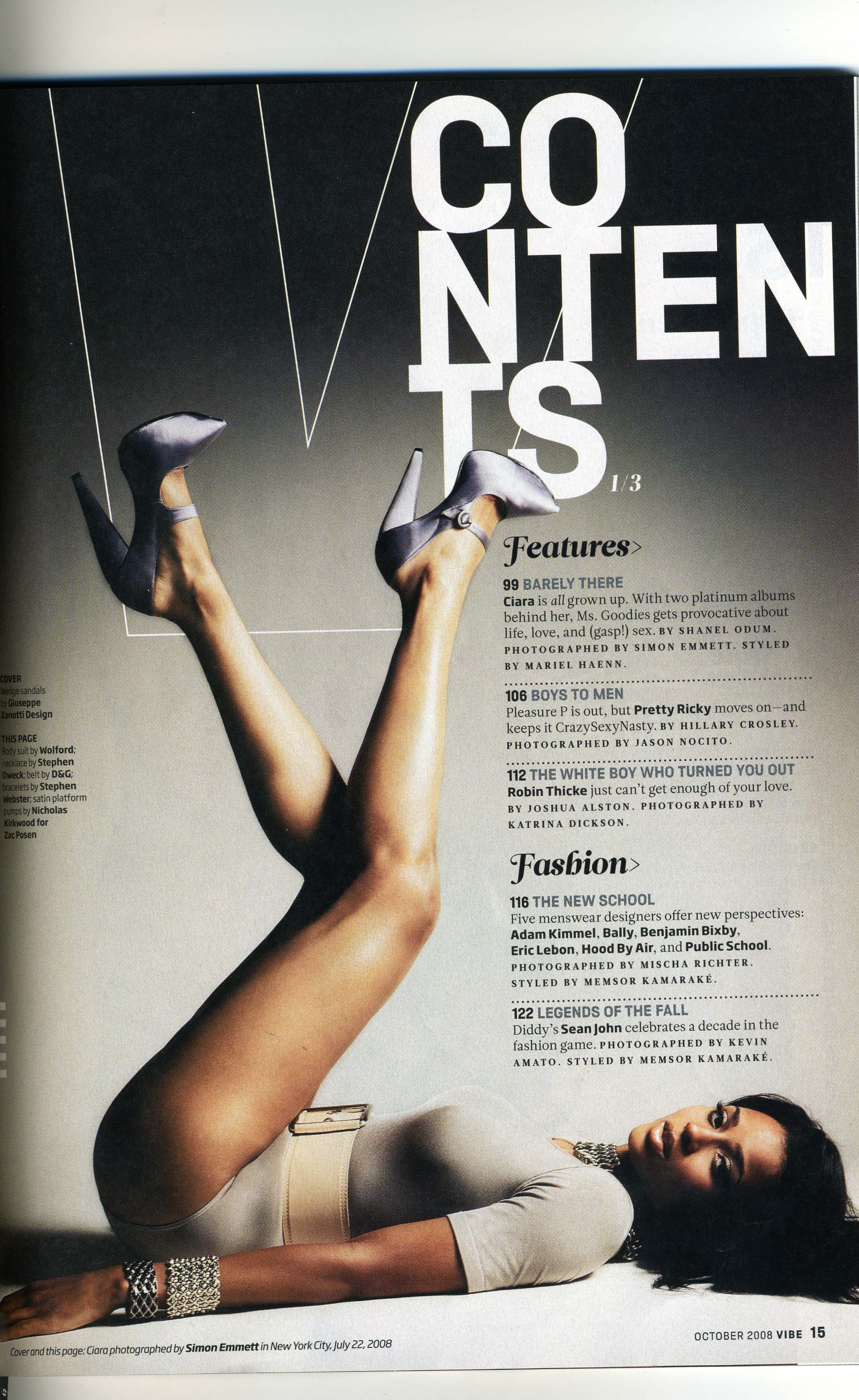
Vibe magazine is a music magazine and the model here is a music artist called Ciara.This magazine is aimed at young males who are interested in music, we know this by looking at the name of the magazine, 'vibe' this word is associated with music. The colours used here are grey, black and white, these colours are very basic but the simplicity of them allows there to be more text without being overwhelming, it also gives a fashionable feeling to the magazine further enticing the demographic. The use of these colours also creates a lot of contrast, for example the white contents page on a dark background, this therefore attracts the readers attention.
The heading of the page links in with the demographic of the magazine as it is broken into chunks on separate lines rather than being on one line, this creates an urban, edgy feel to the magazine, relating to it's target audience. The font used for the heading is bold, this creates a contrast with the rest of the text which is feminine for the sub-headings and plain for the main body. This further builds up the edgy feel to the magazine. The outline of the V is an interesting way to create brand recognition of the magazine as anything similar will be associated with Vibe.
On this page Ciara is lying on the floor with her legs lifted into a V shape, further imprinting the brand. Her pose is in line with the male gaze as she is looking at the camera with a seductive look on her face making the reader feel as though she is looking straight at them. The clothes she is wearing can create an impression of wealth and class which attracts male readers as they want to be with her as she is rich and beautiful and female readers aspire to be like her.
The font of the text is in a bold, feminine style for the headers of each section, compared with the harsher font used for the information of each section. This contrast shows how the magazine appeals to each gender as the main section is strong and masculine and the headers more feminine.
Vogue Contents Page

Vogue magazine is a fashion and beauty based magazine aimed at middle-class women, from the ages of 25-50. The contents page of vogue meets the needs of the demographic of the magazine as it is elegant and not too over the top with colours and information. The masthead of the contents page is the biggest text to attract the reader attention, the simplicity of the font used further reiterates the classic and elegant theme of the magazine. the black font against the whit background makes the masthead bolder and more powerful, showcasing the type of person the reader wants to be, powerful.
The image used on the contents page uses the colour red, this fits in with the rest of the page as the headers are in red, this colour is powerful and passionate creating a level of intimacy with the reader. this explains the models pose which fits in line with the male gaze, she is staring away from the camera, showing she is not dominant and irrelevant. she is pulling her dress up her leg in a provocative manner further increasing the intimacy. The model looks confident in her pose which makes the reader want to be like her and dress like her, further enticing them as the model reflects the magazine.
The us of the headers being in red means they stand out on the page as everything else is in black and white, these colours tie in well together as they are elegant and meet the ideals of the target audience. the font used is also elegant as it is simple and understated without drawing to much attention to any particular section. the section at the bottom of the page is in a bigger font as it is directed straight at the reader, telling them to subscribe to the magazine, the use of this directness makes the reader feel special and increases chances of them subscribing as it is noticeable without being forceful.
GQ Contents Page

This contents page is from the magazine GQ, it is magazine aimed at middle-class men who are between the ages of 25-50, we know this by looking at the deconstruction of the contents page. The image is the main focus of the page, this means that this is most likely the main story in the magazine. the layout of the image and the text boxes all link in well together as they are overlapping, this relates to the image as it is like waves overlapping.
The font used for the masthead and page numbers as well as the logo and date are all slanting forwards, this creates the illusion that the words are moving quickly, this ties in with the theme of the magazine as it is a sports issue. sport is generally fast-paced so therefore the font reflects this. The red line through the word sport also links in with the speedy, sport theme of the page as it looks like a finishing line of a race. The general font used for the rest of the text on the page is fairly plain and simple, this is so not too much attention is drawn towards the smaller, less significant information; such as what each story is about. The title of each story is in bold, capital letters, this is because most of the stories are about sports personalities or events, they are big powerful people or times so the font must reflect this. it makes each story seem important and worth reading as the headings stand out amongst the smaller plain text, making the reader notice them. The amount of writing on the page is rather a lot, this creates a further impression of the importance of each story as they are noticeable and the readers eye is attracted more to them than the other text which they feel in unimportant to them.
The colour scheme of the page is black, white and gold, the richness of these colours relate to the demographic of the magazine as they are men who are fairly well off as the magazine promotes expensive clothes and items. The black mast head stands out on the white and pale blue background of the image, this lets the reader know that this is the most important piece of information and attracts their eye.
Deconstruction of Double Page Spreads
Vibe Double Page Spread
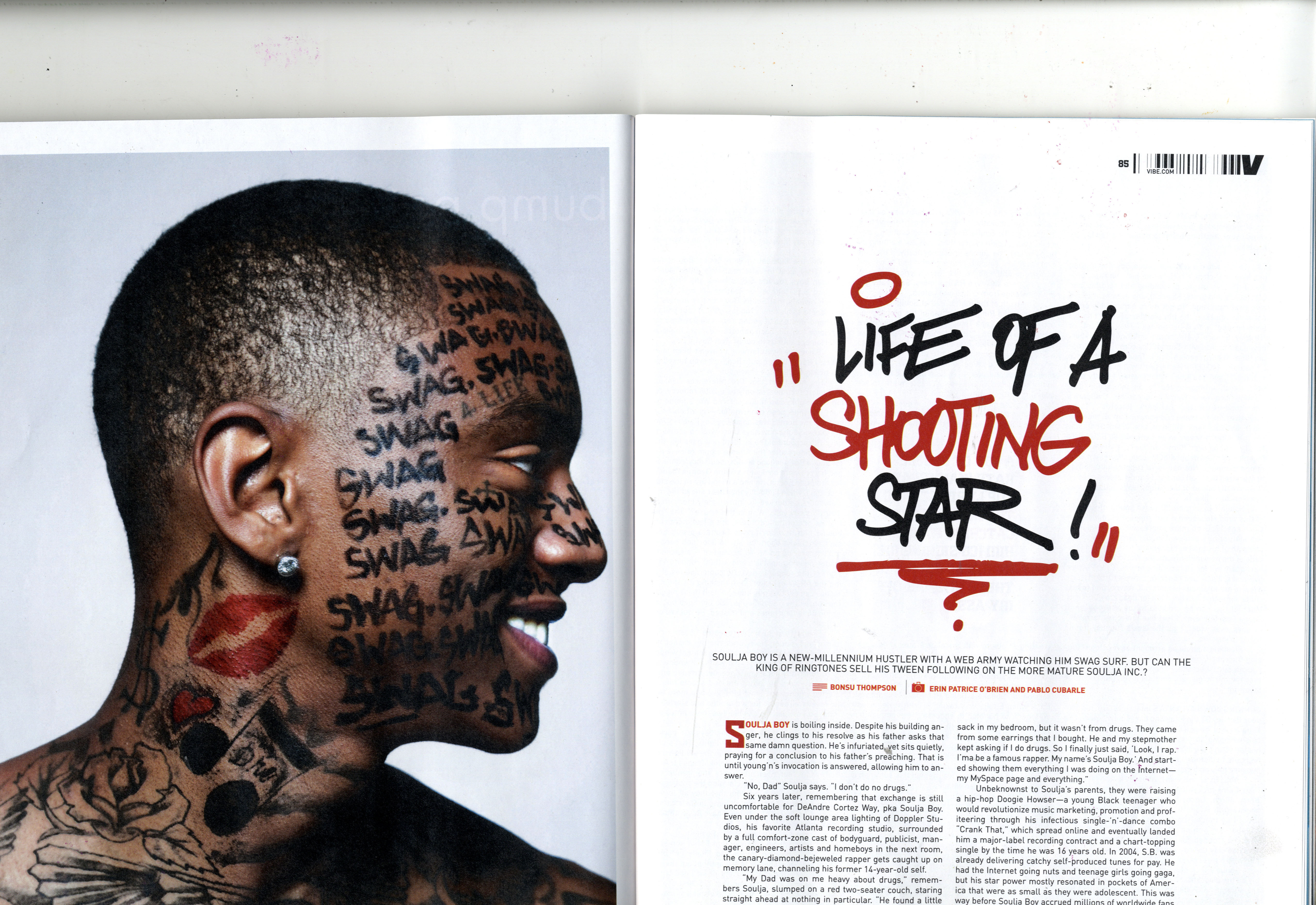
This double page spread is from the magazine Vibe, the artist here is soulja boy, the use of this artist relates to the demographic of the magazine as he is a young artist who makes music that young males who like rap would be into. Graffiti and the word swag, a young persons patois, has been drawn on him, this correlates with the font used on the opposite page for the masthead; which is also in a graffiti style. This relates again to the reader as they may want to be like this artist and these are things he likes, also graffiti is a thing which some young males are interested in, especially those who are into urban, rap music.
The font for the main body used is quite plain and all in black except for the starting words 'soulja boy' this is in red because it ties in with the colour scheme and he is the artist pictured on the left of the spread. the use of the bigger letter is like that used in old fashioned fairy tales, this tells the reader that soulja boy's life is unbelievable amazing and like a fairy tale.
The colour scheme of red, black and white creates an urban feel and the red stands out, this is useful to the reader because it tells them that soulja boy is like the red in a world of black and white. Red also connotes love, it is the most emotionally intense colour so gives the reader a strong sense of emotion and feeling whilst looking at the page, this is useful because it makes soulja boy appeal to the reader and will often make it more of a popular article as it is such a noticeable colour. Black is a colour of authority, this means that soulja boy is a powerful character and the use of these two colours being on the white background makes them stand out even more and show how he besmirches innocence and is an overpowering person.
the catch line underneath the masthead encourages the reader to keep on reading by asking a rhetorical question; 'but can the king of ringtones sell his tween following on the more mature soulja inc?' The use of this question implies the article is going to be interesting and entices the reader into the article.
Vogue Double Page Spread

This double page spread is from a fashion magazine called Vogue UK. The artist on the right hand side is Cheryl Cole, she is within the demographic of the magazine as wealthy woman aged between 25-40. She has been chosen as the main story from the magazine because she is well-known and attractive, women aspire to be like her so are more likely to buy the magazine in hopes of becoming more like her through reading her interview. The use of having the image take up a whole page shows the reader she is a big, influential character.
The dress she is wearing is girly and not something you would usually see on a grown woman but more a child's doll, this is to point out that she is a fragile woman for men to have, this also explains her pose, which is not natural but staged like a dolls. Her shoes are the colour red which connotes love and passion, this is because the interview is about her split from her husband so it shows she is back out looking for love. The green background symbolizes calm and is a refreshing colour, this relates to the artist saying she is a refreshing person who is different. This colour scheme of black, white and the pale green is chic and fits in with the theme of the magazine Vogue, it makes the readers feel as if they too are chic and stylish .
The masthead of the article is 'Survivor' in capitol letters, this relates to what the article is about, it also relates to readers as it makes them want to also be a survivor as it is a powerful word, as if she has beaten death. The font is plain yet the first letter is extremely big in comparison with the rest of the text, this makes the reader want to read on because it makes them wonder what could be so important for such a large font.
GQ Double Page Spread

This double page spread is from the magazine GQ, the article is about Drake and his man of the year nomination. The articles font is basic and is all in black, it has little to no variation of size and font, this appeals to the reader because the magazine is aimed at middle-class men aged between 25 and 50, these men are not looking for bright colours as the magazine is quite serious and the man of the year award is very prestigious so all available space is taken up with information for the readers who aspire to be a man of the year.
The image is on the right hand side, and is a middle-close up, the use of this camera shot is to convey the power and authority that Drake has. the reason it is in black and white is because these are authoritative colours which are classic and timeless, because his face shows no real emotion these colours also portray the lack of emotion and feeling in the image and article- it seems more serious.
The masthead for the article is at the very top of the page and is only one or two sizes bigger than the rest of the text and is in bold, the use of this lets the reader know that no matter what size his name is it is always better and bigger, this is ideal for the magazine as the readers aspire to be like Drake so find everything about the article to be about this power.
Subscribe to:
Posts (Atom)